
10 Most Popular Brick Colors for Modern Homes
- Aug 5, 2025
- 7 min read
Updated: Dec 12, 2025
Brick color changes the mood of a home fast. It affects warmth, contrast, and how texture shows up on a wall. Color also changes how light reads on the surface and how brick sits next to siding, wood, stone, and metal.
Deep red still shows up everywhere. Whitewashed brick stays popular for lighter exteriors. Smoky gray fits clean modern lines. Rustic blends work when a home needs variation and a softer, more natural finish. The best choice comes down to what suits the space, not what looks trendy.
Thin brick has made it easier to apply these looks across interiors and exteriors. With the right surface and grout, it becomes more than a finish. It becomes part of the structure’s identity.
The list below covers the most popular brick colors used in modern homes today.
Red Clay Sets the Foundation for All Brick Colors

Red clay gives the brick that classic look people expect. Color comes from the firing process, not a coating, so the tone feels baked in and natural.
Small shade changes happen in the kiln, so each piece looks a little different. That variation adds depth to the wall without needing extra detail.
Among all brick colors, red remains the most recognized. It fits exterior walls, fireplace surrounds, interior floors, and entryways.
It carries weight and warmth. It matches both rustic and modern styles. That makes it one of the most popular brick colors in use today.
Red sets the baseline for brick. Other colors add variety, yet red tends to anchor the whole look. Grout choice changes the effect fast. Light grout makes red feel brighter and cleaner. Dark grout gives more depth and a heavier outline. No added finish needed.
Red clay also ages well. It suits clean modern lines, traditional homes, and anything in between. When a wall uses red brick, the wall already feels finished.
Our Recommendations for Red Thin Brick
Some brick colors reflect only what the fire and clay produce. No surface treatment is used. The kiln determines every shift in tone.
Antique Collection Ravenna Thin Brick Tiles
Ravenna uses only natural clay. Every tile shows organic variation in shade depending on its place in the kiln. The surface holds depth and texture without any powder or added finish.

Antique Collection Georgetown Thin Brick Tiles
Georgetown includes a black-char surface over red body. The wood ash leaves a darkened effect. Red still appears beneath the surface, but the char carries most of the visual weight.

Whitewashed Brick Color

Whitewashed brick keeps the base of natural clay but softens its tone. The surface appears lighter without hiding the material beneath. This finish works in kitchens, sunrooms, entryways, and any space that needs reflection without shine.
Among different brick colors, whitewashed tones feel calm but not flat. They bring aged character without harsh contrast. The most popular brick colors in this category still reveal the clay underneath.
Some tiles show streaks or faded patches. Others keep a dry matte look. The grout line choice affects the final result more than the paint ever could.
Use this finish where the goal is brightness with texture. It suits minimal designs, rustic blends, or transitional spaces. Whitewashed brick feels lived in without feeling worn out.
Our favorite choice for whitewashed bricks is Antique Collection Ellensburg.
Ash-Grey Brick

Ash gray sits in a sweet spot among brick colors. A light layer of natural ash can settle on the clay during firing, which creates soft gray tones with hints of silver, pale stone, and washed charcoal. Some of the base clay still shows through, so the surface looks natural rather than coated.
Brick colors like ash gray stay popular because they keep balance. The tone feels cool, yet it does not make a room feel dark or overly sleek. It also pairs easily with wood, concrete, and glass.
For kitchens, office spaces, walkways, and neutral feature walls, ash gray works when the goal is texture without a strong color statement. Among brick colors that compete for attention, ash gray tends to support everything around it.
If you want to achieve an even more special design, our Leavenworth collection may be an even better choice, as it provides different shades of gray.
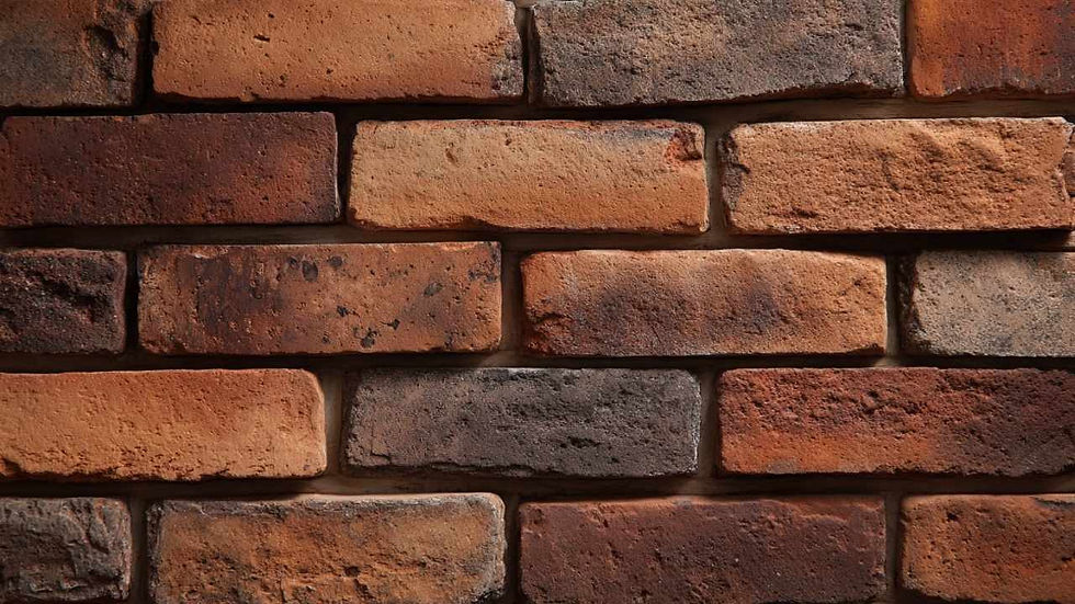
Blended Brick Mix

Blended brick sits in a category of brick colors that relies on planned mixing. Different tones get combined in set ratios, so the wall looks varied without turning messy. Variation shows up, yet the surface still feels controlled and intentional.
Common blends mix raw red, soft ash gray, charred near black, and whitewashed clay. The mix creates movement and contrast, while avoiding that single shade repetition.
Blends work well on floors, long facades, and big walls where one flat tone can feel dull. Small ratio changes can shift the mood fast. More light tones can open a space up. More dark tones can add weight and definition.
Our Rustic Collection is perfect if you prefer a blended mix, as you can choose the notes from white, whitewashed, to full colors(red, grey), all as part of the same package.
Natural Clay Brick Color

Natural clay brick keeps brick colors close to the source. No coating, no stain, no surface treatment. Clay and firing do the work, which keeps the origin consistent while the surface still shows small differences.
Some pieces land warmer, some lean earthy, and some pick up muted orange notes. The kiln brings those shifts out, so the wall never looks flat or factory-perfect. Among brick colors, natural clay reads as the most straightforward and genuine.
Use it where material honesty matters, like porches, entryways, kitchens, and patios. It pairs well with wood, metal, and stone, and each tile shows the character that came straight from the clay and the fire.
Our recommendation - Magnolia Collection
Charcoal Brick

Charcoal brick sits in the darker end of brick colors, yet it stops short of pure black. The tone adds structure and definition, while still leaving enough contrast for light to read on the surface.
Firing can leave soft smoke-like shifts or dry, darker edges, depending on the clay mix. That bit of variation keeps the wall from looking flat.
Charcoal works best when something lighter sits next to it, like pale grout, white walls, or light trim. Contrast keeps the pattern visible and stops the surface from disappearing. Among popular brick colors, charcoal brings depth without making a room feel boxed in.
It fits basements, offices, stairwells, and modern exteriors. Use it to ground a layout and add weight where the space needs it.
Rust-Brown Brick
Rust brown brick blends muted orange with dry red and darker clay notes. The result feels warm and familiar, yet the tone still looks sharp and defined.
It sits between classic red and deeper brown, which makes it easy to pair with aged wood, cast iron, dark trim, and older tile. Among popular brick colors, rust brown brings a sense of age without leaning into nostalgia.
Use it where a bit of history helps, like foyers, fireplace surrounds, and garden paths. Scuffs and weathering tend to look natural on this tone, so it ages in a way that feels earned.
Black Brick

Black brick gives a wall a strong look without relying on a pattern or a glossy finish. Color usually comes from firing clay that includes darker mineral content or char-rich blends.
Some pieces show faint red or brown undertones at the edges, while others stay fully matte and uniform. That small variation can keep the surface from feeling flat.
Among different brick colors, black brings the strongest contrast. It works well for home offices, living room accent walls, and narrow halls where a darker surface can frame the space. Pair it with strong natural light, lighter paint, or pale grout so the brick lines stay visible.
Cream Color

Cream brick comes from pale clay or a lighter firing result, so the color stays soft and calm. Light bounces off it gently, yet the surface still reads as brick, not a smooth finish.
Cream works in spaces that need warmth without a strong color pull. It lifts a wall, keeps a room feeling open, and plays nicely with mixed materials.
Among popular brick colors, cream remains one of the most subtle choices. It works when texture matters more than color, and it pairs easily with wood, matte metal, and natural fabrics.
Pale Taupe

Pale taupe sits between cream and raw clay. Think light beige with a faint gray, dusty edge. The tone stays soft, neutral, and steady.
It brings a hint of earthiness without pulling red or orange, and it keeps a space light without going full white. That balance makes it easy to live with.
Pale taupe works well in open-plan rooms, bright kitchens, and workspaces. It earns a spot among popular brick colors because it supports other finishes without competing with them.
Our suggestion - Antique Collection Leavenworth Thin Brick Tiles
Tips to Match Brick Colors with Interior Design

Brick color should support the room, not compete with it.
Use whitewashed or cream tones in small rooms or where natural light is strong. These keep the space bright without flattening the texture.
Pick charcoal or ash-grey for contrast against white walls, concrete, or metal fixtures. These colors calm the surface without draining it.
Choose red or rust-brown in areas with wood beams, brick fireplaces, or warm-tone flooring. They add depth and connection.
Avoid too much variation in narrow spaces. Stick to even finishes if the wall is small or broken up by windows and shelves.
Test with grout lines before installing. A change in grout color can shift the entire surface tone.
Match the brick finish to the floor material. Rough clay works with raw oak. Smooth cream fits polished stone.
Final Thoughts
Brick color shows up before furniture, rugs, or wall art. It changes how a room reads, how light hits the wall, and how nearby finishes feel next to it. Pick a tone that fits the layout and the materials already in the plan.
A good brick color does not feel like decoration. It sets the base and lets the rest of the space make sense.


